|
Thanks for visiting "bobpage.com". I created it so that I could understand the basics of setting
up a webpage. I wanted to know more about "HTML" and "Javascript", getting a domain (bobpage.com),
uploading graphics and code, and whatever else was involved in getting a website up and running.
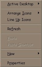
I primarily enjoyed getting an idea of what I wanted to have, then trying to figure out how to make it work. I needed some kind of content, so I picked a few personal interests and tried to build pages around them. I wanted to have some subject matter, and not just a bunch of pictures. I haven't done a very good job in that area. It takes too much time to do it right. The most challenging part of creating a webpage is writing coherent text. It's not easy for me to use proper writing to convey a thought. What you see here is the best that I can do. It's the main reason that I have taken so long to get this site online. I've owned the domain for quite a while. I laid out about seven pages in a week, but typing in what I wanted to say took months. I've rewritten this page about five times. I initially tried using Microsoft Front Page to set up the site. After about five minutes, I dumped it, and decided to learn HTML code for myself. Using raw code made the process a lot more interesting and more challenging. Another challenging part of creating a web page is making something that looks and acts the same way to every visitor, independant of PC hardware and web browser differences. The purpose for this "About this Site" page is to let you know how to best view my web site with the web browser that you use, and the graphics capabilities of your computer. Regarding web browsers, this web site has been tested in Netscape and Internet Explorer. There are HTML tags that are accepted by Netscape, but not by Internet Explorer, and vice versa. I have tried to accommodate both, and have not tested any others. I hope to enhance my pages through the use of more Java and Javascript. They make make web pages more interesting, and more interactive. My pages are viewable in all the standard screen resolutions from 640 x 480 to 1600 x 1280, but you'll probably find 1024 x 768 to be the optimal setting. "Resolution" refers to the quality of the picture in pixels. A "pixel" is the smallest part of the image displayed on your screen. A displayed image is composed of many pixels, or dots. So, "1024 x 768" is 1024 horizontal dots across the screen by 768 vertical dots up and down the screen. By comparison, traditional televisions sets run 512 horizontal "scan lines" with 480 viewable - the other lines are "cropped" out. I used the term "lines" because a television's signal is different. It's an analog signal that paints lines horizontally across the screen instead of individual dots. Analog refers to being "continuous" (Think of an traditional clock with a "second hand" - its movement is continuous). Digital refers to being "incremental" (Think of a digital clock - it moves in specific increments). A computer uses a digital signal to display a pixel that is some balance of red, green, and blue (RGB). The orange color of this page is represented as "FAA31E" in Hexidecimal: Red - FA, Green - A3, and Blue - 1E. Every PC has a setting for resolution. To find out what your resolution setting is, go to the "Display Properties". Here's how... (anywhere on your wallpaper) You'll see a menu that looks like this: 
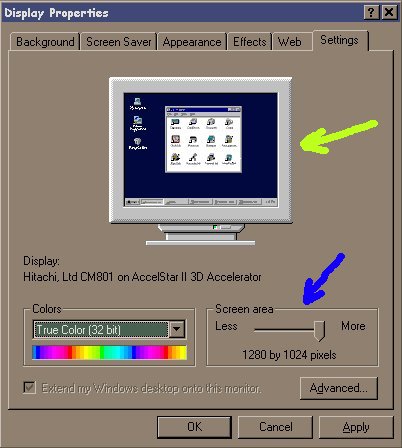
Click "Properties", to get the "Display Properties" dialog box. Then, click on the "Settings" tab at the top to get this screen: 
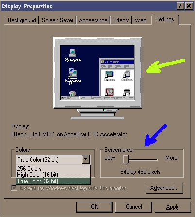
Go to the section where the blue arrow is that says, "Screen area". This is the resolution setting. Notice that this PC is set for 1280 x 1024 resolution. That is the best setting for this PC. The setting for the screen below shows 640 x 480 resolution. Compare the screens at the yellow arrows. Notice how much less of the screen is visible in this setting. 
Lastly, make sure that you have the "Colors" set as high as your computer will allow. Sometimes when you adjust the colors higher, your PC may lower the resolution, because your video card cannot do both high resolution and high colors. If that is the case, try to get a good balance somewhere in the middle. However, this page is best viewed at "True Color". It DOES make a difference... |
Back to the Main Page...